Flexbox
Flexbox Layout
- Flexbox is a one-dimensional layout method for arranging items in rows or columns. Items flex (expand) to fill additional space or shrink to fit into smaller spaces.
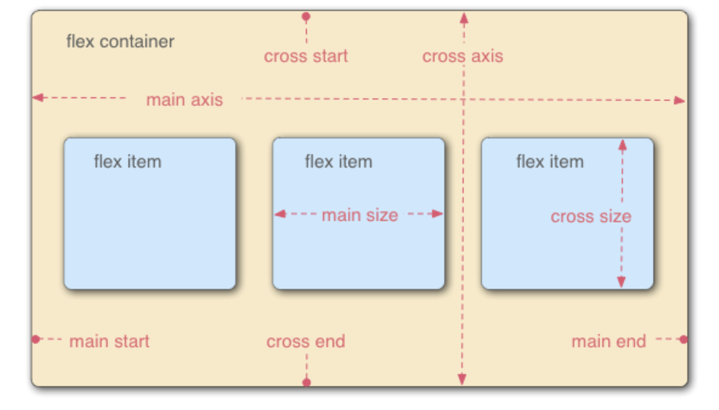
- When elements are laid out as flex items, they are laid out along two axes:
- Main Axis – the axis running in the direction the flex items are laid out in (for example, as rows across the page, or columns down the page.) The start and end of this axis are called the main start and main end.
- Cross Axis – the axis running perpendicular to the direction the flex items are laid out in. The start and end of this axis are called the cross start and cross end.
- Main Axis – the axis running in the direction the flex items are laid out in (for example, as rows across the page, or columns down the page.) The start and end of this axis are called the main start and main end.
Let’s see this in action.
Flex Direction
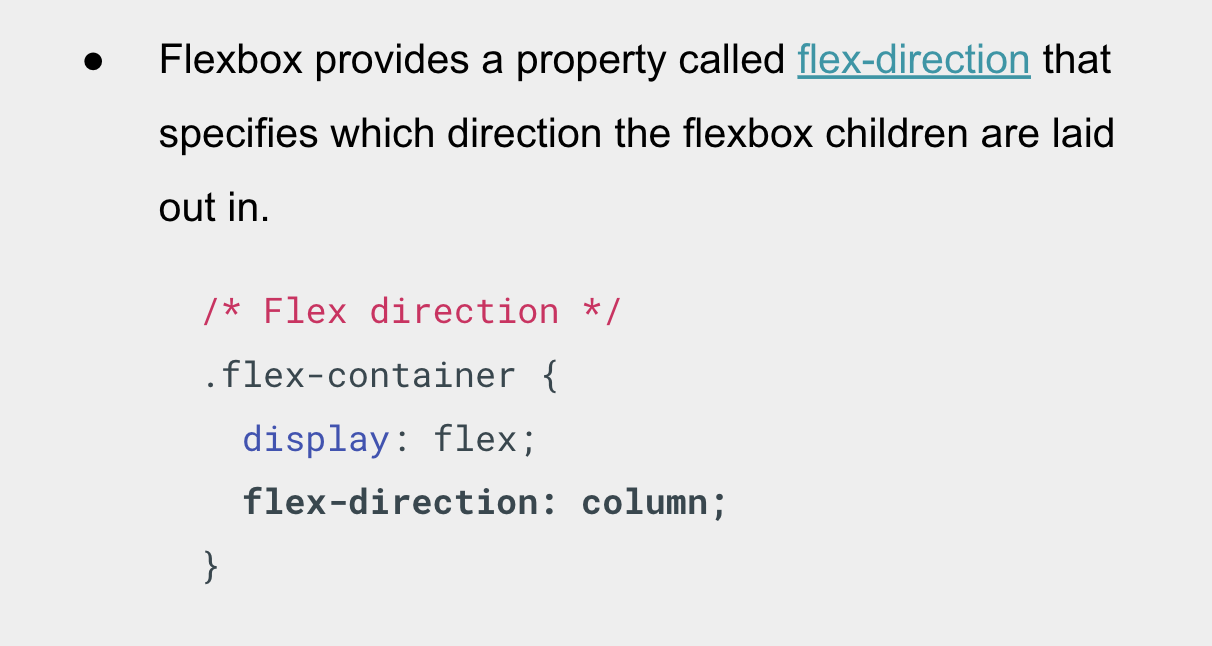
- Flexbox provides a property called flex-direction that specifies which direction the flexbox children are laid out in.Â
- By default this is set to row, which causes them to be laid out in a row in the direction your browser’s default language works in (left to right, in the case of an English browser).
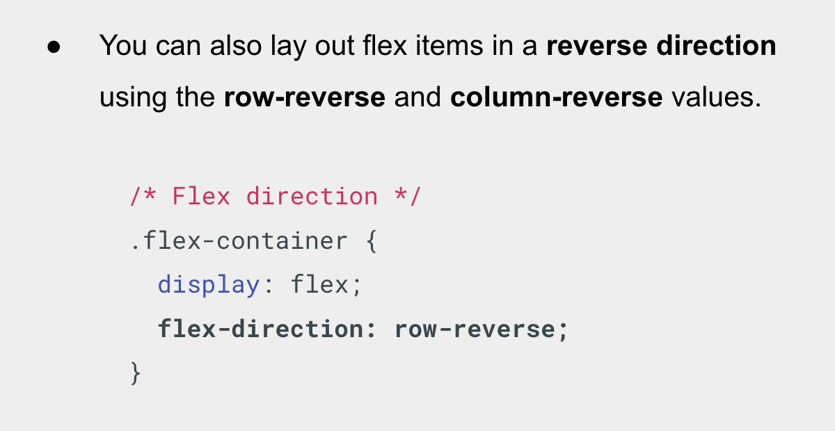
You can also lay out flex items in a reverse direction using the row-reverse and column-reverse values. Let’s experiment with these values too!
Flex Wrap
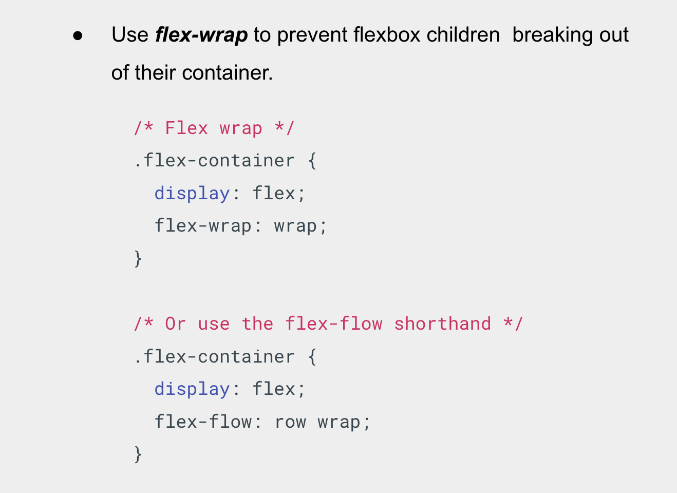
- One issue that arises when you have a fixed width or height in your layout is that eventually your flexbox children will overflow their container, breaking the layout.
- The flex-wrap property helps to fix this problem.
- It’s worth noting that a shorthand exists for flex-direction and flex-wrap – the flex-flow property.
Flexible Sizing
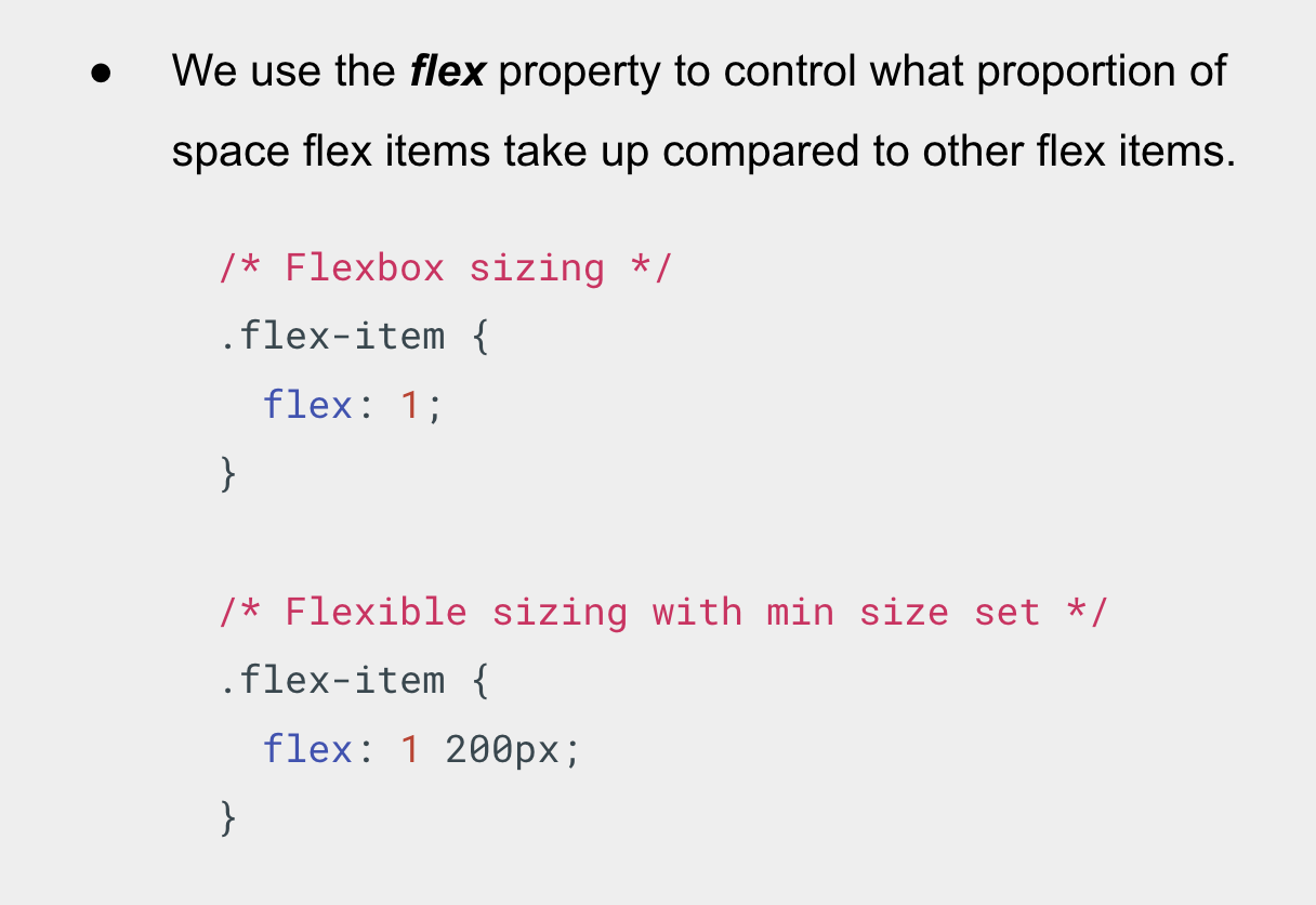
- Let’s now return to our flexbox example and look at how we can control what proportion of space flex items take up compared to the other flex items.
- If we had 3 items in a flexbox container, what the code above does it sets their width equally. Which means they’ll all take up an equal amount of the spare space left after properties like padding and margin have been set.
- You can also specify a minimum size value within the flex value.
- Let’s see it in action.
Flexible Alignment
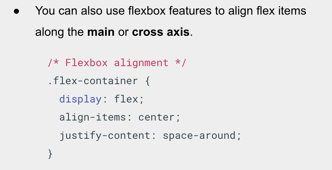
- You can also use flexbox features to align flex items along the main or cross axis, that’s;
- Horizontal
- Vertical
- The align-items property controls where the flex items sit on the cross axis.Â
- The default value is stretch. The center value that we used in our above code causes the items to maintain their intrinsic dimensions, but be centered along the cross axis.
- You can also have values like flex-start and flex-end, which will align all items at the start and end of the cross axis respectively.Â
- The justify-content controls where the flex items sit on the main axis.
- The default value is flex-start, which makes all the items sit at the start of the main axis.
- You can use flex-end to make them sit at the end.
- The center value makes the flex items sit in the center of the main axis.
- The value we’ve used, space-around, is useful — it distributes all the items evenly along the main axis with a bit of space left at either end.
- There is another value, space-between, which is very similar to space-around except that it doesn’t leave any space at either end.
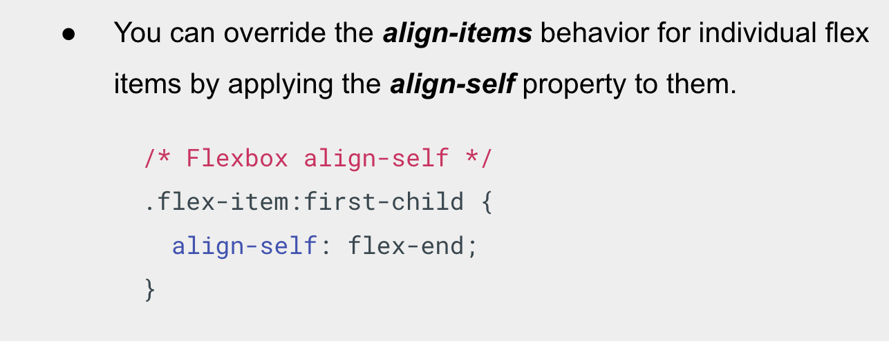
- You can override the align-items behavior for individual flex items by applying the align-self property to them.
- Let’s see it in action.
Flexible Ordering
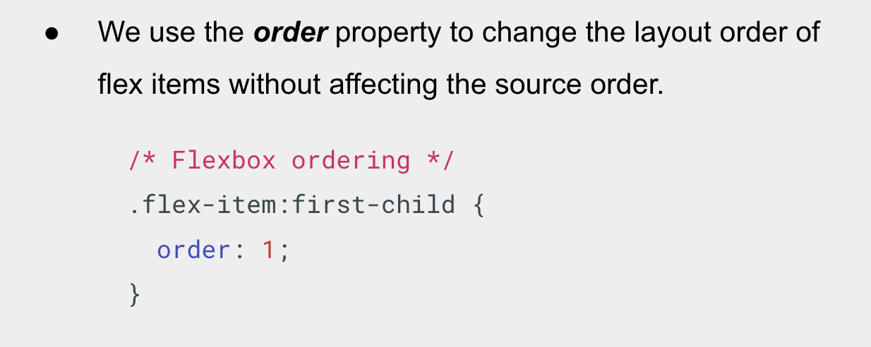
- We use the order property to change the layout order of flex items without affecting the source order. This is another thing that is impossible to do with traditional layout methods.
- By default, all flex items have an order value of 0.
- Flex items with higher specified order values will appear later in the display order than items with lower order values.
- Flex items with the same order value will appear in their source order.
- You can set negative order values to make items appear earlier than items whose value is 0.
- Let’s see it in action.