Media Queries
Media queries are useful when you want to modify your site or app depending on a device’s device’s general type (such as print vs. screen). Here are some of the most common use cases.
- To conditionally apply styles based on features like device types or screen sizes.
- Building responsive websites.
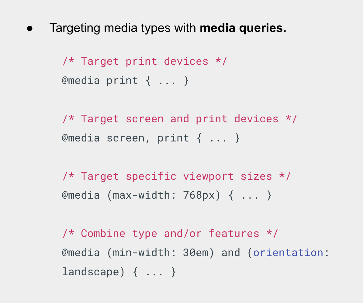
- Media types define the broad category of device for which the media query applies: all, print, screen.Â
- The type is optional (assumed to be all) except when using the not or only logical operators.