Grid
Grid Layout
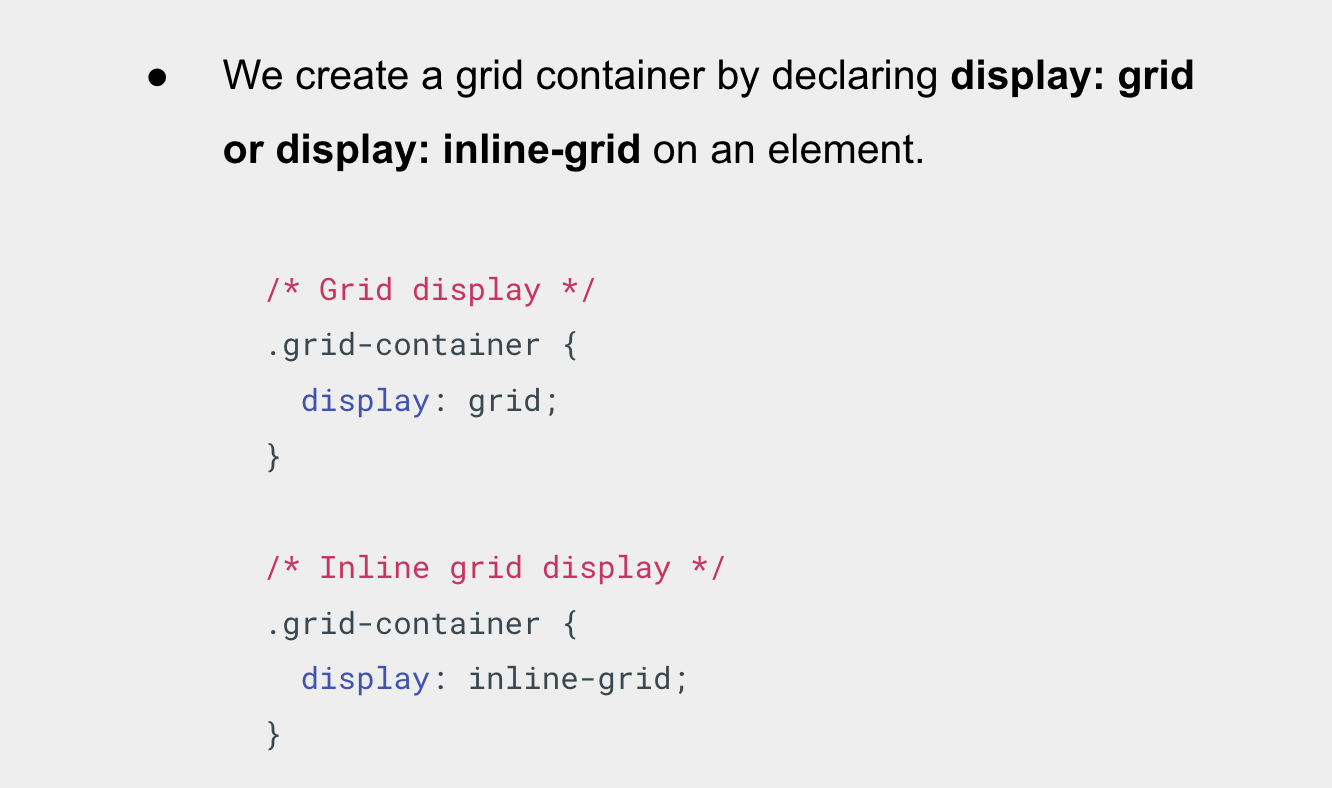
We create a grid container by declaring display: grid or display: inline-grid on an element.
Grid Styles
As you learn and then work with the CSS Grid Layout this Browser DevTools will give you a better idea of what is happening with your grids visually.
Grid Tracks
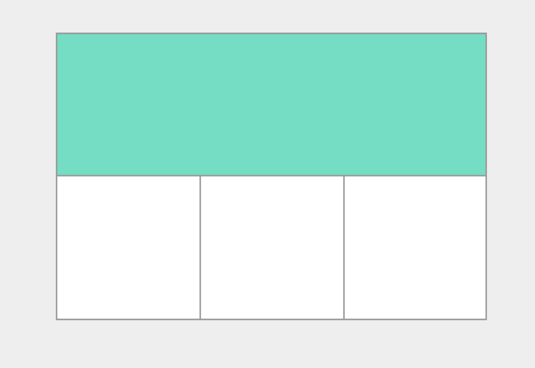
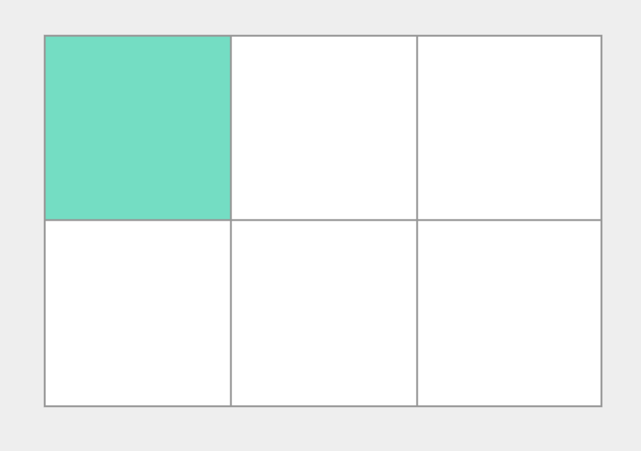
So what’s a grid track?
- A grid track is the space between any two lines on the grid. In the image you can see a track highlighted – this is the first row track in our grid.
- We define rows and columns on our grid with the grid-template-columns and grid-template-rows properties.
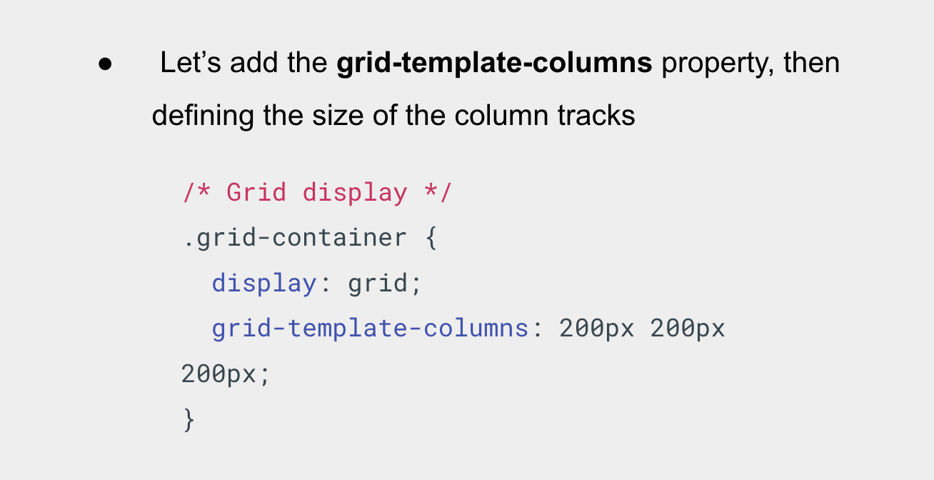
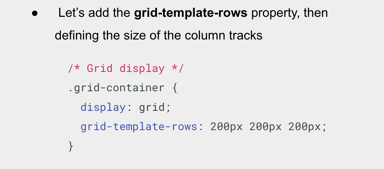
- Let’s revisit our earlier example and add the grid-template-columns property, then defining the size of the column and row tracks as 200px;
Grid Columns
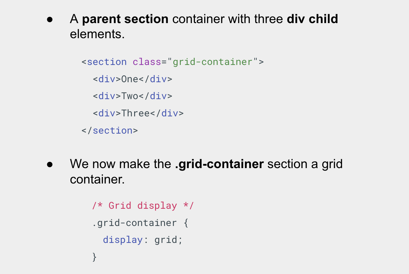
Let’s head over to our html page and see this in action.
Grid Rows
The fr Unit
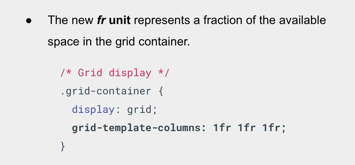
- Tracks can be defined using any length unit. Grid also introduces an additional length unit, the fr unit, to help us create flexible grid tracks.
- The next grid definition would create three equal width tracks that grow and shrink according to the available space.
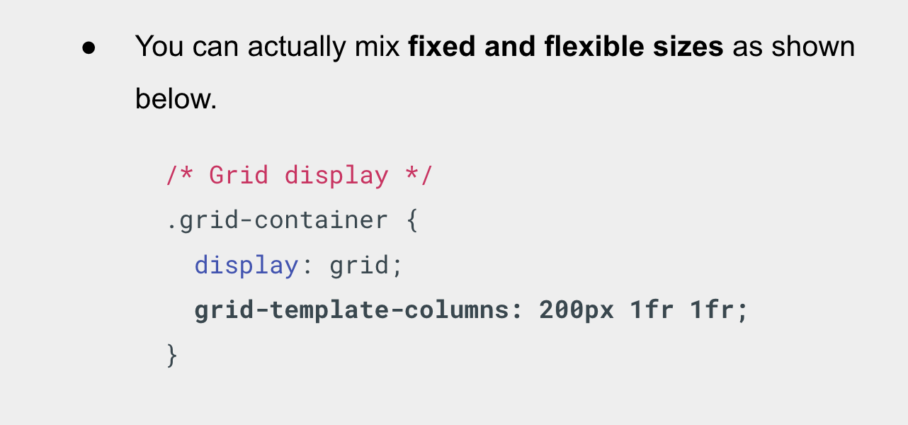
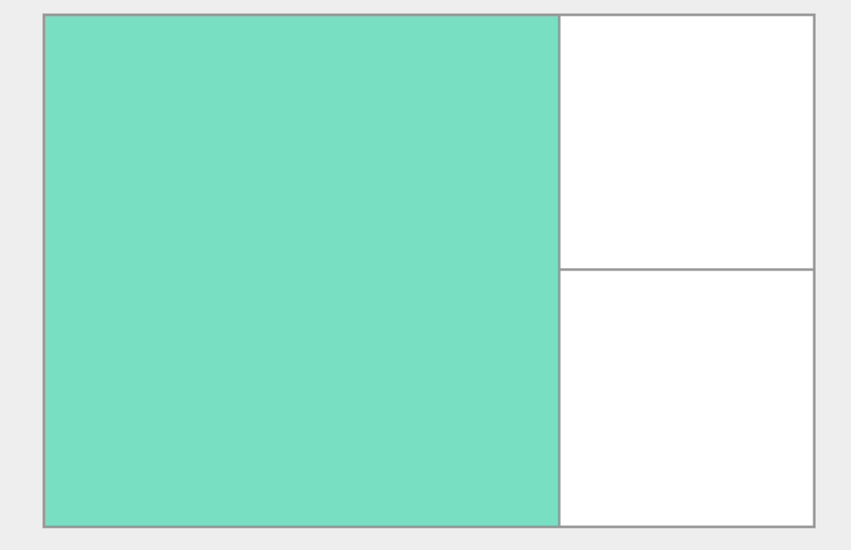
- In this final example, we mix absolute sized tracks with fr units. The first track is 200 pixels, so the fixed width is taken away from the available space.
- The remaining space is divided into two and assigned in proportion to the two flexible tracks.
The repeat()
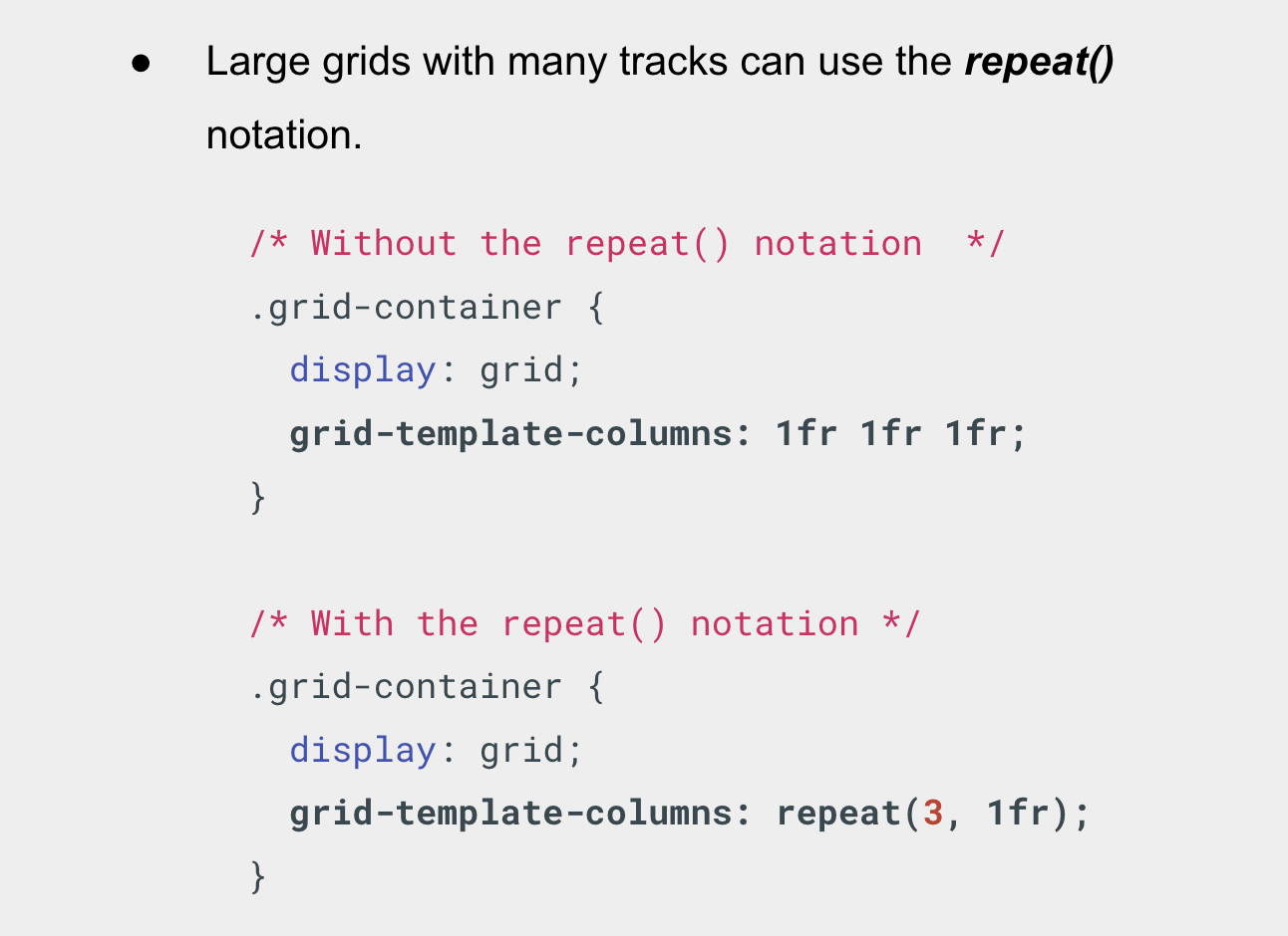
Large grids with many tracks can use the repeat() notation, to repeat all or a section of the track listing.
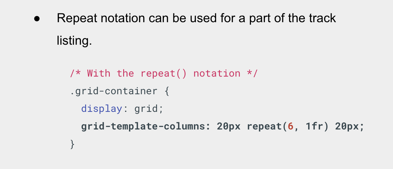
Repeat notation can be used for a part of the track listing. In this next example we create a grid with an initial 20-pixel track, then a repeating section of 6 1fr tracks then a final 20-pixel track.
Grid Rows
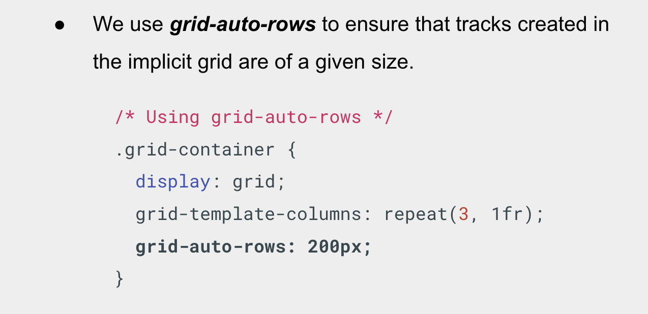
We use grid-auto-rows to ensure that tracks created in the implicit grid are of a given size. In this case 200px.
Grid Minmax()
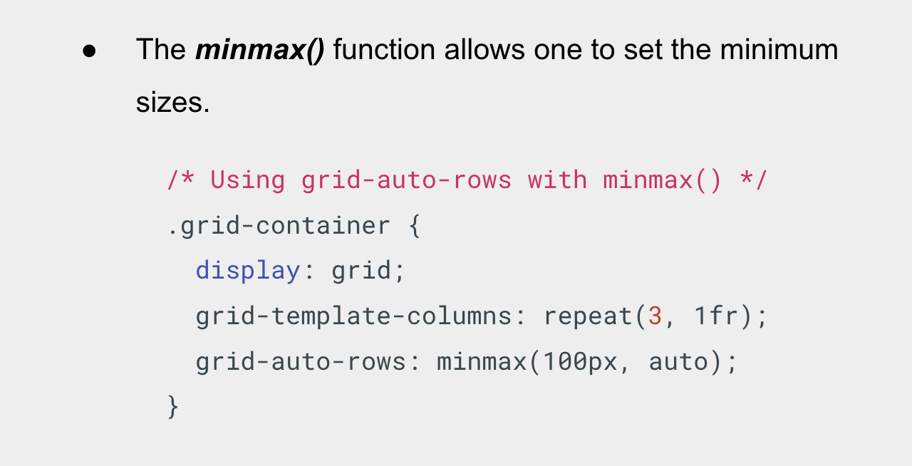
- In some cases, I may want my rows to never collapse smaller than 100 pixels, but if my content stretches to 300 pixels in height, then I would like the row to stretch to that height.
- This means automatically created rows will be a minimum of 100 pixels tall, and a maximum of auto.
- Using auto means that the size will look at the content size and will stretch to give space for the tallest item in a cell, in a given row.
Grid Lines
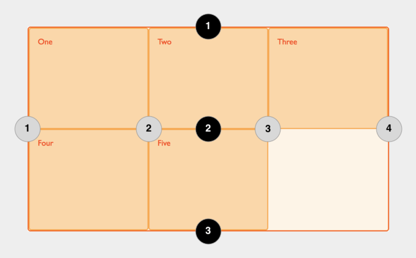
- When we define a grid we define the grid tracks, not the lines. Grid then gives us numbered lines to use when positioning items.
- In our three column, two row grid, we have four column lines and three row lines.
Grid Cells
A grid cell is the smallest unit on a grid.
Grid Areas
Items can span one or more cells both by row or by column, and this creates a grid area. Grid areas must be rectangular.
Grid Gutters
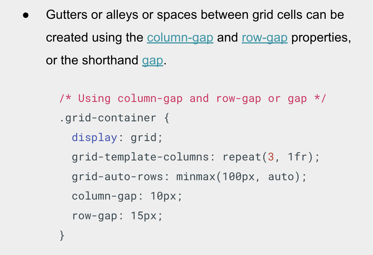
- Gutters or alleys or spaces between grid cells can be created using the column-gap and row-gap properties, or the shorthand gap.
- In the example, I am creating a 10-pixel gap between columns and a 15-pixel gap between rows.